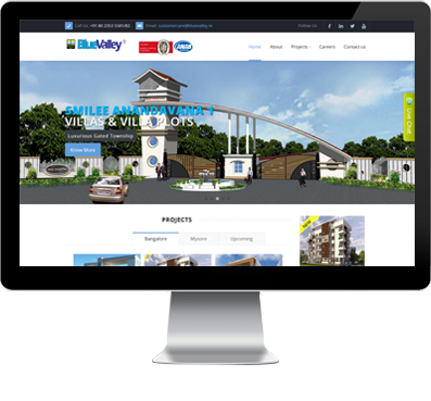
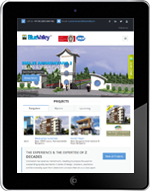
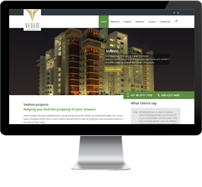
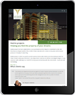
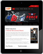
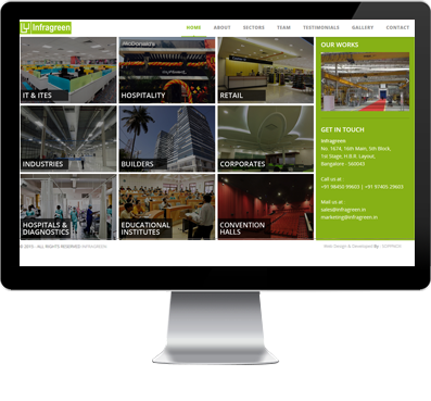
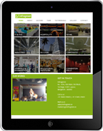
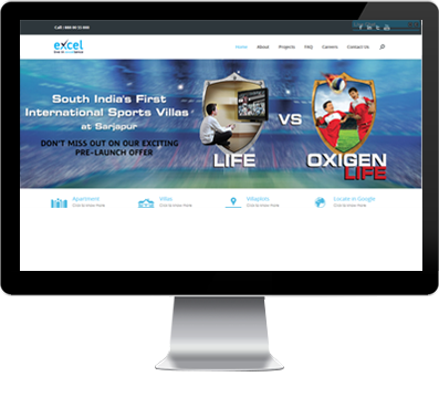
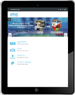
Time has come for your website to provide users of all types of devices an amazing experience
A website is responsive when it fits all sizes of screens perfectly. Users can easily navigate through your website providing them an excellent experience.
+Read More
Gone are the days when developers designed websites only to be viewed on desktop computers. With the use of mobile phones and tablets increasing rapidly, responsive website design is here to stay.
Why businesses need to switch to a good quality responsive website?
Ever come across a website that gave you a hard time due to bad design and caused you to leave? This is exactly the problem Soppnox is solving as one of the best responsive web design company in Bangalore.
EXCELLENT USER EXPERIENCE & VISUAL PLEASURE
Our responsive website designing services include the use of fluid grids, media queries and flexible images which allows us to fit content into huge or small screens effortlessly.
Tablet or mobile phone users don’t need to scroll, pan or resize their window while viewing your website. We can also provide a wider range of content that is optimized for mobile websites and easy on the eyes of the user.
SINGLE WEBSITE
Soppnox follows the best responsive website design practices using Bootstrap(Framework) and JQuery Media (CSS). A single code base supports users who use different sizes of screens. Just ONE site will need to be maintained, which will also benefit your SEO strategy. You also do not lose any of your original site content when your website is optimized for mobile.
Why is Soppnox the best responsive website designer?
We provide a variety of customized mobile friendly design templates for your website
- Our responsive websites deliver solid results and are a visual treat
- We help you stay better prepared for the future world of mobile technology.
Improve user experience with the best responsive design
- Close